FACEBOOK AD REVIEW: Legal Book & Seal

Once a week I’m going to give you a review of a Facebook ad, sharing what I like and what I don’t like about the ad. The goal is to help you avoid mistakes, inspire you with some practical advice and have fun!
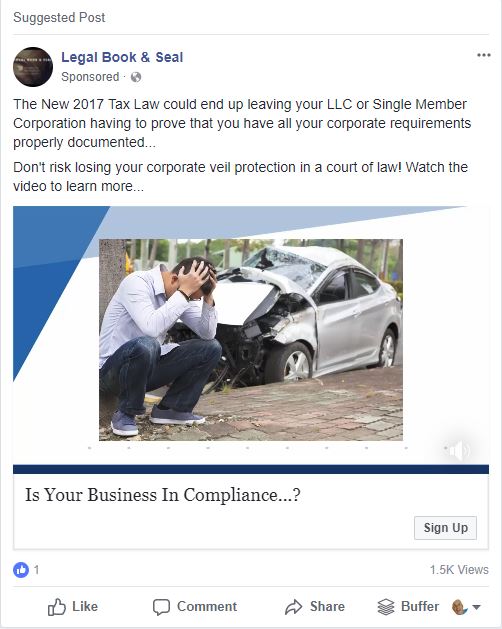
The first ad is by Legal Book & Seal. The first thing I see in this ad is a crashed car, which makes me think its an auto insurance ad. That’s not good, make sure your graphic (or video thumbnail) is representative of your product and guides the prospect into thinking about your thing.
The ad starts off with a pretty ugly first line of copy… “The New 2017 Tax Law could end up leaving your LLC or Single Member Corporation having to prove that you have all your corporate requirements properly documented…”
This first line is critical, because it’s all that mobile viewers will see. There’s really no pain point here, and definitely not a strong call to action. Let’s go on to the second line, maybe it gets better…
“Don’t risk losing your corporate veil protection in a court of law!”
OK, that’s a strong line. It’s got me wondering how that would happen.
“Watch the video to learn more…”
Noooooo. Don’t ask me to watch a video! You had my attention, close the deal with a free consultation! If it was a short video then this may not be an issue, but it’s almost three minutes long. Ouch!
Let’s jump down to the Headline of the ad: “Is Your Business in Compliance? [Sign Up]“. The headline doesn’t match the button – what am I signing up for?
This ad is a train wreck.
Don’t make the same mistakes as these guys, let’s jump on a phone call so I can help you write a strong ad, with an eye-catching graphic and a strong close. Grab an open time slot on my calendar: https://alexbranning.com/call